
Your Thumbnail Is Your First Impression
Before anyone watches a single second of your video, they see your thumbnail. It's your billboard on the YouTube highway. And if it doesn't stop the scroll, your content never gets a chance. Most weak click-through rates trace back to a handful of repeatable thumbnail mistakes, not bad luck.
The average CTR on YouTube is 2–10%. Top creators consistently hit 8–12%. The difference? Their thumbnails, and specifically, avoiding the thumbnail mistakes below.
Mistake #1: Too Much Text
Your thumbnail is tiny on mobile (where 70%+ of YouTube views happen). Cramming a full sentence into it makes it unreadable.
Fix: Use 3–5 words maximum. Make them bold, large, and high-contrast. The text should complement the image, not replace it.
Mistake #2: Low Contrast and Dull Colors
Thumbnails compete with dozens of others on a viewer's screen. Muted colors and low contrast make yours invisible.
Fix: Use bright, saturated colors. Create strong contrast between your subject and background. Yellow on dark, white on bold colors, and red accents all perform well.
Mistake #3: No Emotional Expression
The human brain is wired to notice faces. But a neutral face doesn't trigger engagement, emotion does.
Fix: Show genuine emotion, surprise, excitement, curiosity, even frustration. Exaggerate slightly for the camera. The thumbnail that makes someone feel something is the one that gets clicked.
Mistake #4: Cluttered Composition
If there's too much going on, the viewer's eye doesn't know where to land. A cluttered thumbnail is a skipped thumbnail.
Fix: Follow the rule of three: one subject, one text element, one background. Keep it clean and focused. Your thumbnail should communicate one clear message in under 1 second.
Mistake #5: Inconsistent Branding
If every thumbnail looks completely different, viewers can't recognize your content in their feed. Consistency builds recognition.
Fix: Develop a thumbnail template: consistent font, color palette, and layout style. Your audience should be able to spot your video before reading the title.
Good vs Bad Thumbnails: Side by Side
| Element | Bad thumbnail | Good thumbnail |
|---|---|---|
| Text | Full sentence, tiny font | 3–5 bold words, high contrast |
| Colors | Muted, low contrast | Bright, saturated, subject pops |
| Face | Neutral or no face | Clear emotion (surprise, curiosity) |
| Layout | Cluttered, multiple messages | One subject, one message |
| Branding | Different every upload | Consistent template viewers recognize |
Three More Thumbnail Mistakes That Quietly Kill CTR
The first five are the obvious offenders. These three are subtler, and just as damaging:
Mistake #6: The thumbnail lies about the video. Clickbait that oversells earns the click but wrecks retention when the payoff never comes, and YouTube's systems weigh watch time heavily. A thumbnail should promise exactly what the video delivers, no more.
Mistake #7: Ignoring mobile scale. You design on a 27-inch monitor; your viewer sees a postage stamp. If the subject and text aren't legible at 120 pixels wide, it doesn't matter how good it looks full-size. These scale-blind thumbnail mistakes are the most common of all.
Mistake #8: Matching, not contrasting, the feed. If your colors blend into YouTube's white-and-red interface and the other thumbnails around you, you disappear. Pick a palette that fights the feed.
How to Test and Fix Your Thumbnail Mistakes
You don't have to guess which thumbnail mistakes are costing you clicks, YouTube hands you the data. Here's a simple loop:
- Check CTR in YouTube Studio. Sort your videos by impressions click-through rate. Anything well below your channel average is a thumbnail problem first, a title problem second.
- Squint at it. Shrink the thumbnail to mobile size, or literally squint. If you can't tell the subject, emotion, and promise in one second, neither can a scrolling viewer.
- Change one variable. Swap the text, boost the contrast, or change the expression, then re-upload and watch CTR for a week. Changing everything at once teaches you nothing.
- Build a template from your winners. Once a thumbnail beats your average, reverse-engineer why and turn it into a reusable layout. Consistency is how you stop repeating the same thumbnail mistakes upload after upload.
Fixing thumbnail mistakes is one of the highest-leverage things a creator can do, because a two-point CTR bump compounds across every impression the algorithm ever serves.
It helps to reframe the thumbnail as part of the content, not decoration bolted on at the end. The best creators design the thumbnail and title before they film, then make the video deliver on that promise. Working in that order kills two problems at once: it prevents the clickbait mismatch that tanks retention, and it forces you to pick a genuinely clickable angle up front. If you can't picture a scroll-stopping thumbnail for your idea, that's a signal the idea itself may be too flat to earn clicks, better to learn that before you spend a day editing than after. Treat every thumbnail as a testable hypothesis, and the same discipline that eliminates thumbnail mistakes will sharpen your packaging across the whole channel. Do it long enough and you'll build an instinct for what stops the scroll in your niche, at which point avoiding these mistakes stops being a checklist and becomes second nature. And because the thumbnail is the very first thing every potential viewer sees, that instinct pays back on every single video you'll ever publish.
How Creator AI Helps
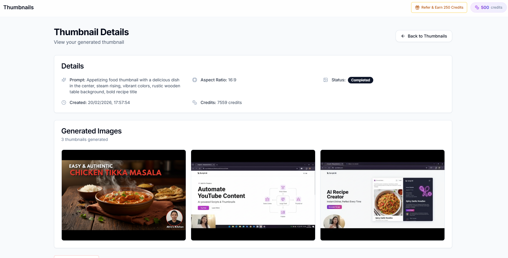
Creator AI's thumbnail generator creates YouTube-optimized thumbnails that follow all of these principles automatically. Bold text, high contrast, emotional triggers, and clean composition, generated in seconds and ready to upload.
Stop guessing what works. Let data-driven AI create thumbnails that drive clicks.
Keep Reading
- How to Write YouTube Scripts That Get More Views
- How to Find Trending YouTube Video Topics (Step-by-Step)
- Generate on-brand thumbnails in seconds, see features or start free.
- Review YouTube's own thumbnail guidelines.
Frequently Asked Questions
What thumbnail mistakes hurt my click-through rate?
The five biggest are too much text, low contrast and dull colors, no emotional expression, cluttered composition, and inconsistent branding across your videos.
What is a good YouTube CTR in 2026?
Most videos sit between 2–10%. Top creators consistently hit 8–12%, and the difference is almost always the thumbnail, not the topic.
How many words should a YouTube thumbnail have?
Use 3–5 words maximum. Thumbnails are tiny on mobile, where most views happen, so bold, high-contrast text that complements the image beats a full sentence.
How can I improve my YouTube thumbnail CTR?
Use bright, saturated colors with strong contrast, show genuine emotion, keep one clear subject, and reuse a consistent template so viewers recognize your videos instantly.